There are car badges that mean speed, and there are car badges that mean money. The three-pointed star has always tried to mean something harder to fake: authority.
For most of the last century, the way Mercedes-Benz translated that authority into sheet metal didn’t change much — a Mercedes was upright, formal, and unmistakably serious, whether it was a taxi or a state car. What has changed, sometimes gradually and sometimes in one sharp turn, is how the company has interpreted that seriousness for each generation of buyer.
Tracking that shift means tracking a handful of design chiefs, each of whom inherited a brand that already knew exactly what it was, and each of whom had to decide how far it could bend without breaking.

Image source: Wikimedia Commons
The engineer’s era
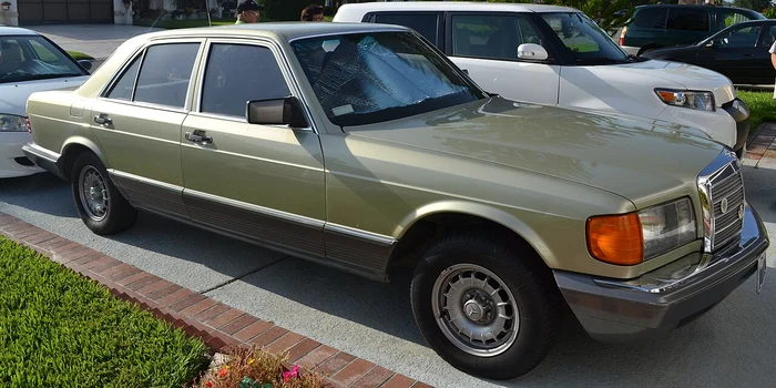
For much of the postwar period, Mercedes-Benz design wasn’t really a separate discipline from engineering — it was an extension of it. Men like Karl Wilfert and Friedrich Geiger shaped cars from a position of technical authority, and the results looked it: the "Ponton" sedans of the 1950s, the finned W111 of the early 1960s, the boxy but beautifully proportioned W123 of the mid-1970s.
Chrome was used generously, but never carelessly. Surfaces were flat and honest rather than sculpted.
A Mercedes from this period looked engineered first and styled second, and that was precisely the point — the design was meant to communicate solidity, not flair.
That philosophy reached its most disciplined form under Bruno Sacco, an Italian-born, German-trained designer who took over as chief designer in 1975 and held the position for nearly a quarter-century, until his retirement in March 1999. Sacco’s guiding principle, still quoted inside the company today, was deceptively simple: a Mercedes-Benz must always look like a Mercedes-Benz.
He formalized this into two related ideas — "horizontal homogeneity," meaning every model in the current lineup should visually belong to the same family, and "vertical affinity," meaning a new model should still look related to the one it replaced, so an owner’s investment in the brand’s aesthetic never felt stranded.
Under Sacco, the W126 S-Class, the W124 E-Class, and the R129 SL all shared a restrained, almost architectural language: crisp shoulder lines, minimal ornamentation, glass areas that prioritized visibility over drama. It was a design philosophy built for longevity rather than headlines, and it is a major reason why 1980s and 1990s Mercedes models still look composed rather than dated.
A quieter interlude
When Sacco retired, the company did not go looking for an outside star designer, as its supervisory board had reportedly considered. Instead it promoted from within, handing the role to Peter Pfeiffer, a trained porcelain modeler who had joined Mercedes alongside Sacco’s own longtime deputy back in 1968.
Pfeiffer was, by most accounts, an unassuming leader at a moment when rival design chiefs elsewhere in the industry were becoming celebrities in their own right. His tenure, running from 1999 to 2008, is often remembered as a bridge rather than a revolution — a period that preserved Sacco’s disciplined proportions while the company’s model range expanded rapidly into new segments like compact cars and crossovers.
It was a necessary, steadying decade, even if it rarely gets its own chapter in the brand’s design story.
Sensual purity
The real stylistic break came in 2008, when Pfeiffer was succeeded by a 39-year-old designer named Gorden Wagener, making him the youngest design chief in the company’s history at the time. Wagener had joined Mercedes in 1997, right at the tail end of the Sacco era, after early stints at Volkswagen, Mazda, and General Motors, and he was notable for being the first Mercedes design boss without an engineering background — a pure designer, trained at the Royal College of Art in London.
That distinction mattered. Where his predecessors had approached form as a byproduct of function, Wagener approached it as an emotional argument in its own right.
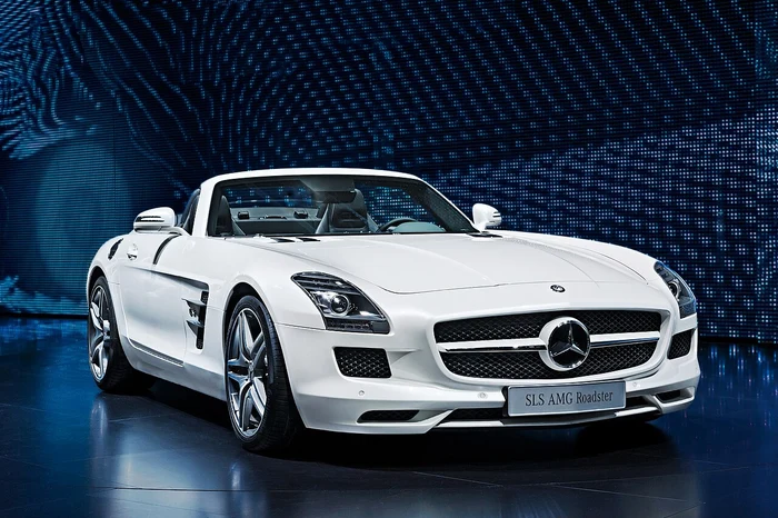
Image source: Wikimedia Commons
He called his philosophy "sensual purity," later refined into the phrase "sensual clarity" — the idea that a surface should be clean enough to look modern and technical, but sculpted enough to catch light in a way that felt organic rather than mechanical. The car most often credited with proving the theory was the CLS, the four-door coupe that gave Mercedes a genuinely desirable, low-slung alternative to its more formal sedans, and which opened the door to a wave of similarly styled models — the CLA, the GLE Coupe, the GLC Coupe — aimed at a younger, more design-conscious customer than the brand had traditionally chased.
Wagener’s design leadership also touched some of the era’s most memorable individual shapes: the gullwing-doored SLS AMG, the reborn Mercedes-Maybach line, and the modernized-but-still-recognizably-boxy G-Class, a vehicle whose silhouette he chose to preserve almost entirely rather than reinvent.
Over his eighteen years running Mercedes design — nine of them as the first-ever Chief Design Officer, a board-level role created for him in 2016 covering Mercedes-Benz, AMG, Maybach, and the G-Class as a standalone sub-brand — Wagener’s fingerprints ended up on nearly every surface of the company, literally. His design remit expanded beyond cars into architecture, yachts, and even helicopter interiors through the Mercedes-Benz Style division, on the theory that "sensual clarity" was a brand identity, not just a body-panel treatment.
It’s a philosophy that has now defined every Mercedes-Benz and Mercedes-AMG model since roughly 2016, characterized by clear contours and reduced, taut surfacing rather than the sharper creases favored by some German rivals during the same period.
What "sensual purity" actually looked like in the metal
It’s worth being specific about what changed under Wagener, because "sensual purity" can sound like a slogan rather than a working method. In practical terms the approach showed up as:
- Surfaces with fewer hard creases and more continuous, slowly rolling curvature — panels that carry a highlight along the car rather than breaking it at a sharp character line
- Grilles that grew larger and more upright as status symbols, particularly on S-Class and AMG models, even as the surfaces around them got smoother
- A coupe-like roofline applied to body types that had never worn one before — mid-size sedans and SUVs as well as two-door cars — on the theory that a sloped roof reads as sportier and more premium
That last idea proved one of Wagener’s more commercially significant bets: the CLS-style silhouette, once a novelty, became a repeatable formula across segments for buyers who wanted visual drama without giving up practicality.
Interiors moved in a parallel direction. Where Sacco- and Pfeiffer-era cabins were organized around discrete, clearly labeled controls, the Wagener years pushed toward integrated, screen-dominated dashboards with ambient lighting used almost as a design material in its own right — strips of color that could shift mood and signal status the way chrome trim once did.
The two shifts, exterior surfacing and interior screen integration, developed on parallel tracks for years before finally merging most completely in the electric-era cars, where a smoothed exterior and a screen-filled cabin were designed together from the outset rather than retrofitted onto an existing platform.
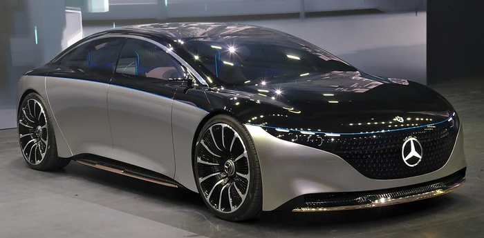
Image source: Wikimedia Commons
The electric reset
The arrival of dedicated electric architecture forced a design conversation Sacco and Pfeiffer never had to have: what happens to a brand’s face when it no longer needs a traditional grille to breathe? Mercedes’ answer, first previewed on concept vehicles and then carried into production EQ-badged models, was the "one-bow" silhouette — a single, unbroken arc running from hood to trunk, with a smoothed, often illuminated nose treatment replacing the vertical chrome grille that had anchored the brand’s face for a century.
It was, by the design team’s own admission, one of the more contested internal debates of the Wagener era: how much of the traditional Mercedes face could be softened before the car stopped reading as a Mercedes at all. The compromise view — visible on cars like the EQS and EQE — kept the star large and central even as the surrounding brightwork shrank, betting that the emblem itself, not the grille shape around it, was the non-negotiable piece of brand identity.
A new hand on the pencil
That bet is now being tested by a new generation of leadership. Wagener announced his departure at the end of January 2026, closing out nearly three decades at the company, and was succeeded by Bastian Baudy, previously head of design at Mercedes-AMG.
The handover arrived alongside a notable design signal: the Vision Iconic concept, unveiled in Shanghai in October 2025, which deliberately revived a large, upright, chrome-heavy grille reminiscent of the brand’s prewar Simplex models — a visibly different instinct from the smoothed-over EQ face that had defined the brand’s electric cars just a few years earlier. Whether that grille language becomes the next production-car signature, or simply one design study among many, is the open question facing Baudy’s studio now.
What’s consistent across every one of these handovers — Wilfert to Geiger, Sacco to Pfeiffer, Pfeiffer to Wagener, and now Wagener to Baudy — is that none of them treated the star on the hood as decoration. Each design chief inherited a brand that already had an unusually clear idea of what it was supposed to look like, and each one’s real job was never to invent a new identity from scratch.
It was to decide how much that identity could stretch, generation after generation, without ever stopping being recognizably, unmistakably a Mercedes-Benz.
Leave a Reply
You must be logged in to post a comment.